H/T to Thomas Cott for inspiring this latest entry into what seems to be an ongoing rant regarding font size. No, I’m not complaining about Cott’s font sizes, his are terrific, but one of the articles at arts.gov included in his latest newsletter made me realize that there continue to be far too many arts focused sites out there still using unacceptably small font sizes.
 Not only do small font sizes damage a visitor’s vision but it lowers conversion rates and page stickiness; in short, it reduces engagement and can tick-off visitors.
But the really frustrating aspect here is this issue has been hashed out throughout the online web design community for more than five years (which is practically an eon in web developer time).
Although the font family and line height settings (the distance between each line of text) will impact an optimum font size to use, a reasonable target is the 16px or 1.0em neighborhood, in fact, we covered this issue all the way back in 2012 in a post titled 16px Font Size and 48px Wide Buttons Are The New Black.
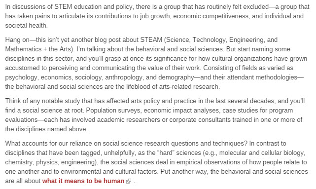
Let’s take a look at that arts.gov site as an example, currently, they are using a 13px font size which looks like this:
But here’s what it would look like if they bumped up the font size to 16px:
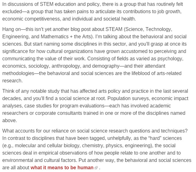
Granted, if you’re viewing this on a mobile device, you may need to expand both images to full size in order to get feel the magnitude of improvement but the difference is as clear the nose on your face. The larger font size is easier to read and produces far less eye strain.
And to be fair, arts.gov is far from lonely; a quick scan of my daily bookmarks turned up a few additional tiny font breaches, including MusicalAmerica.com, 13px font size, and The Chronicle of Philanthropy which uses 14px font size, although it comes across as smaller than it is thanks to using a font family with especially heavy serifs. Americans for the Arts is another 14px offender and even though they are using a sans-serif font family, it still produces a good bit of eye strain thanks to some especially tight line height settings.
The really good news here is upgrading stylesheets to use acceptable font sizes is perhaps one of the easiest items to adjust on most websites. In fact, many content management systems provide a way to edit font size through a point and click admin panel that doesn’t require the site manager to know a lick of code nor any help from a programmer.
For a frame of reference, the content you’re reading here at Adaptistration is 16px font size, 1.5em line height, at a high contrast #252525 font color over a #F4F4F4 background color. Granted, as time marches on, I wouldn’t be the least bit surprised to see those figures grow a bit as the field of web design doesn’t seem to be straying from that path any time soon.
Related Posts
-
About a decade ago, the notion of ticketless events was a hot topic but it was several years ahead of its time. Fortunately, the…

-
The 5/18/2016 edition of Fortune.com published an article by David Meyer that highlights a new piece of wearable technology designed to provide deaf people…

-
Did you know that a routine boilerplate included in many grant agreements (especially those from government sources) stipulates the receiving organization agrees that their…

It’s a problem across a wide range of websites, complemented by the “pale grey” text syndrome and other low-contrast issues. Of course it’s not just websites – I’ve unsubscribed from more than one magazine because of the same crimes being committed on paper.
In a former life as a software program manager I was constantly lecturing designers about producing something that didn’t require you to be a 25yo with 20:20 vision. Nothing much has changed,
I chuckled when you mentioned the pale gray font color becasue it never ceases to amaze me how many off-the-shelf premium themes for most major publishing platforms have that exact default font color. It make me wonder if that doesn’t exacerbate the problem simply becasue many users assume it is an acceptable color choice.
It may be an (over-)reaction to the garish Flash content of earlier years, but both schools are guilty of imprisoning content in a narcissistic presentation.
See also the comments on minimalist ideology here http://www.nngroup.com/articles/roots-minimalism-web-design
Bingo.